Orange — Rebrand
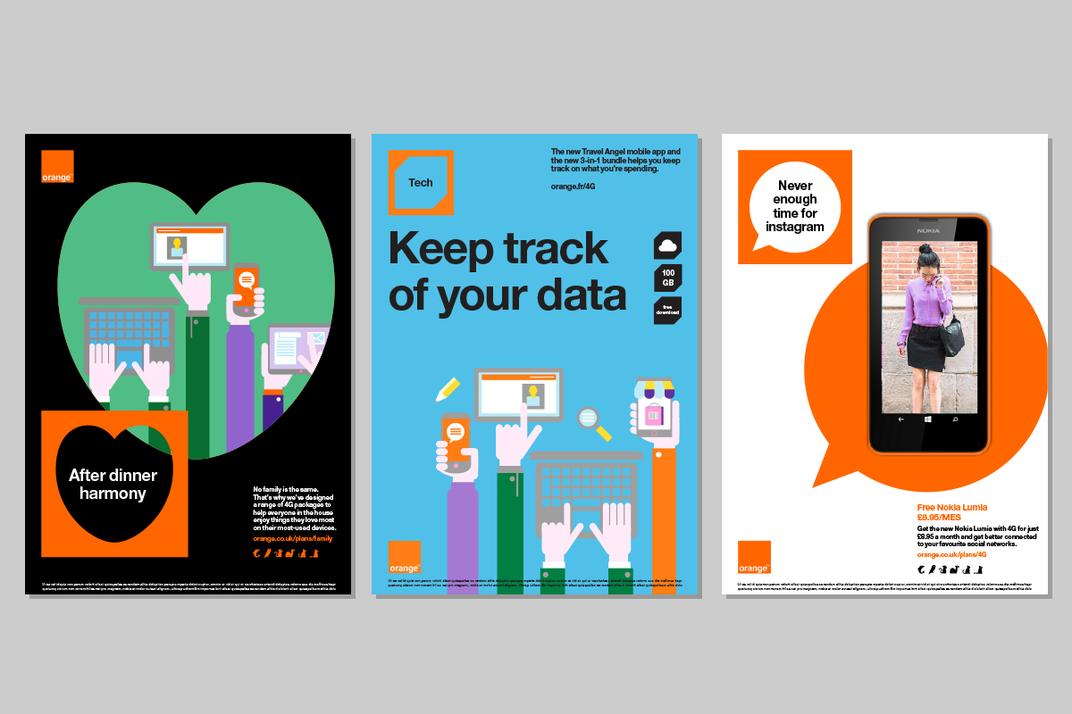
The core idea for Orange's rebrand revolves around the principle of 'listening and responding': listening to the customer's needs and understanding what is truly essential to them which allows Orange to respond appropriately with a rich customer experience across all of their touch-points.
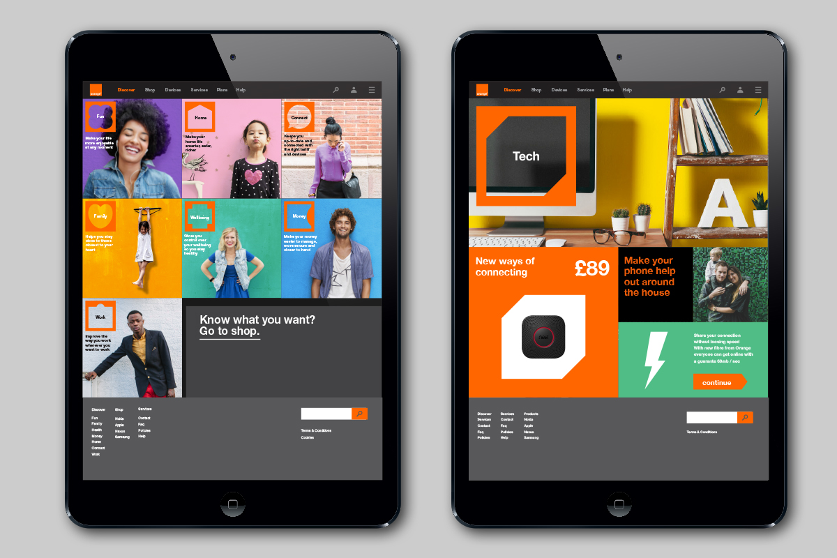
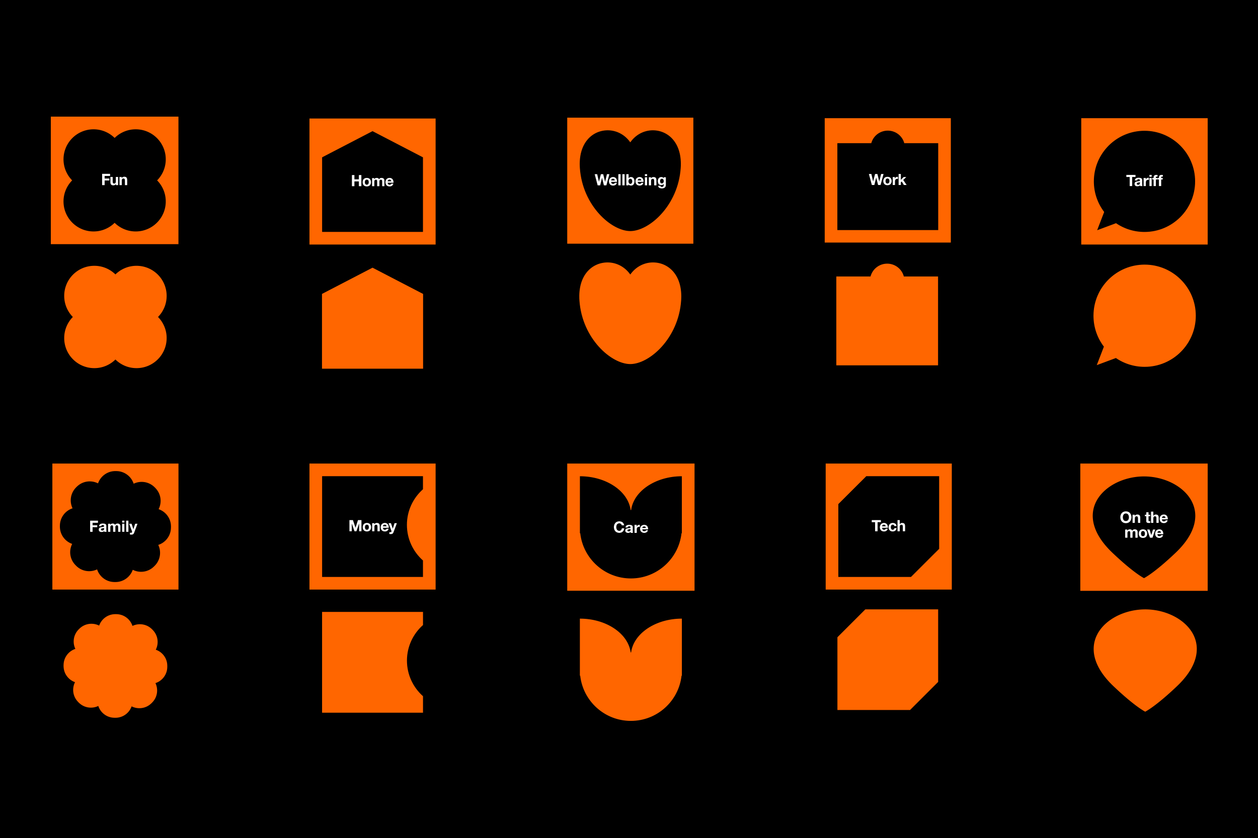
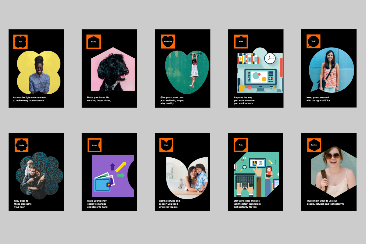
Themes have been identified which are essential for people across the world. The visual system represents the themes with frames that contain the customer insight, followed by a pop-out that shows how Orange responds with a relevant product, service or benefit.
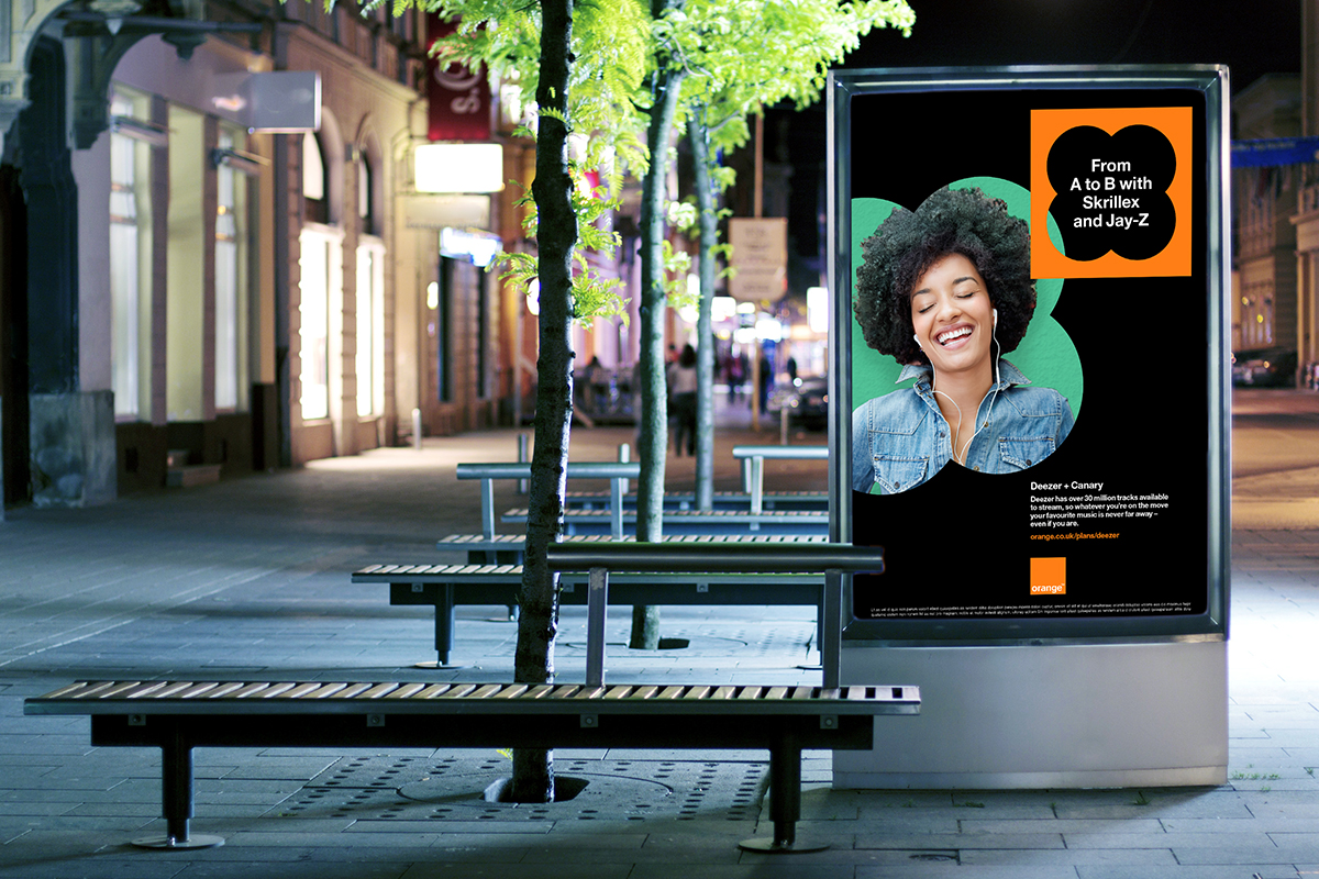
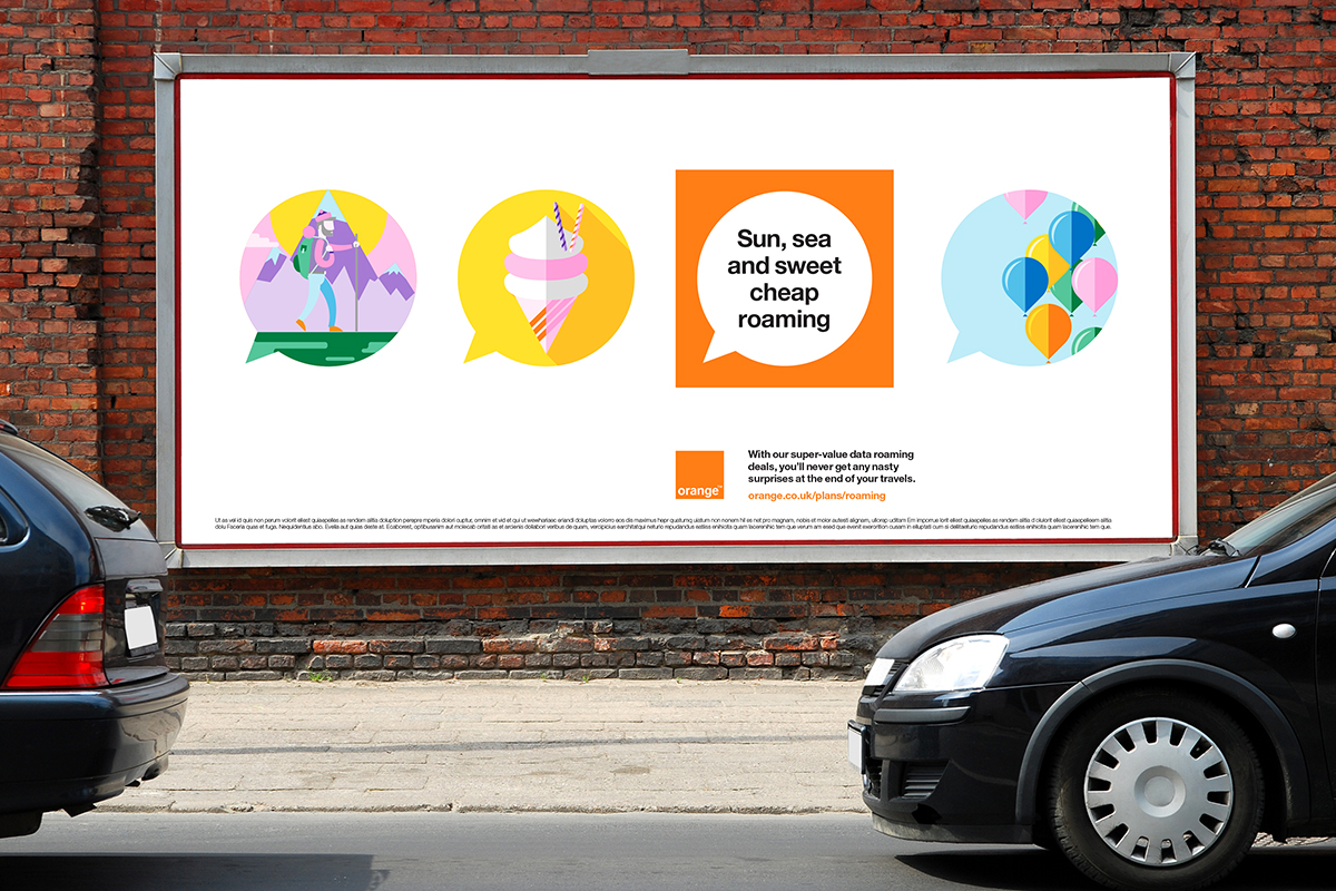
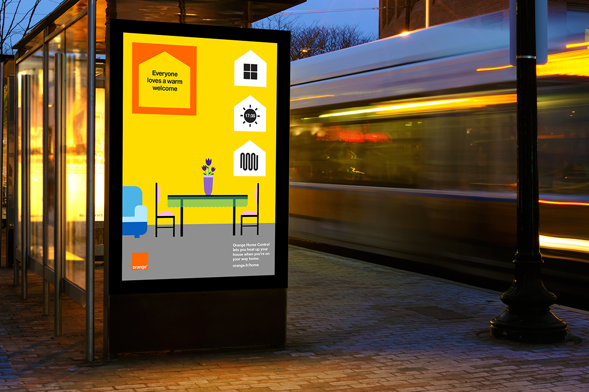
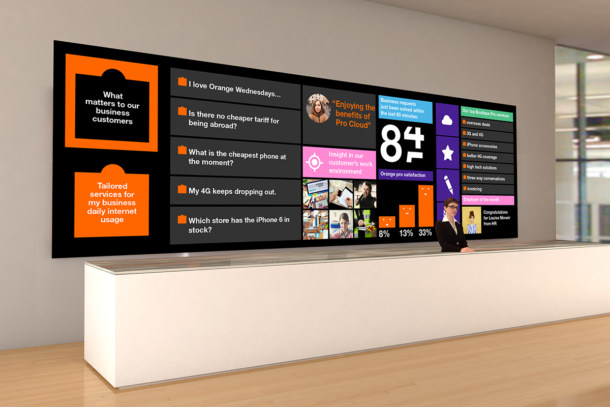
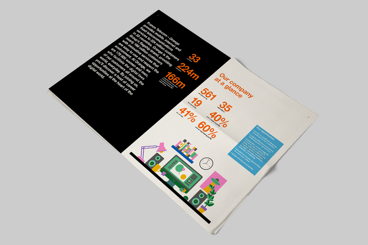
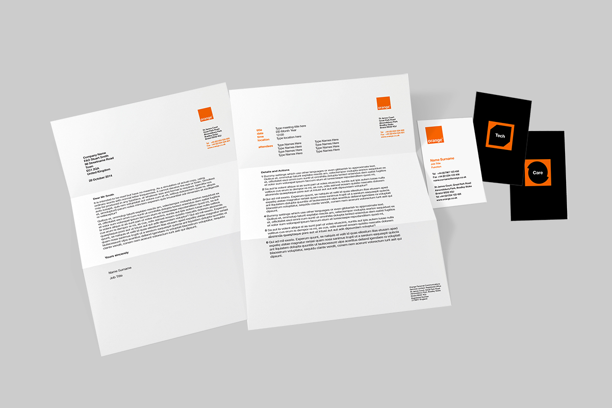
This graphic system and core idea has been applied across multiple touch-points. Below are some visual examples which I helped the team at Wolff Olins to bring alive, such as designing frames for themes (e.g. family, society or care) or visualising various print communication and interactive applications.
Wolff Olins | Development | Design | © 2015


